
Strips, Stripes and Supergraphics
The surface of your world matters

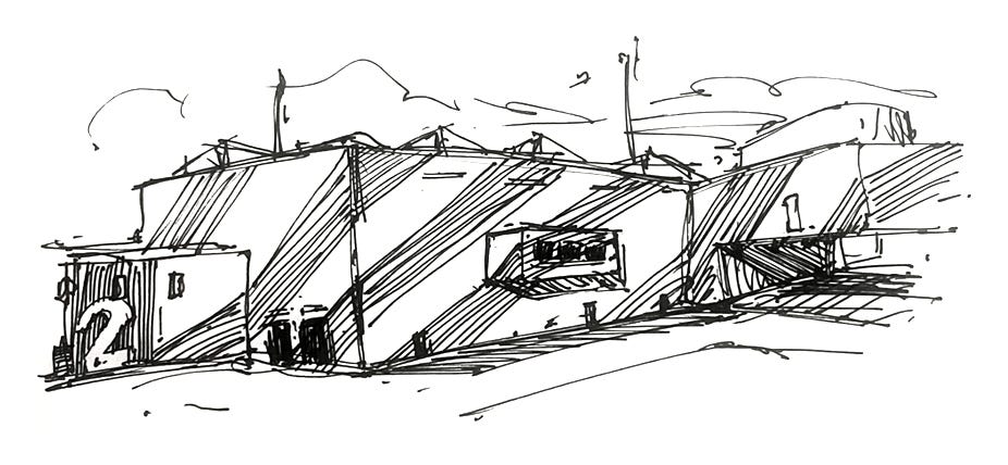
Supergraphics are a design approach which some game worlds make great use of as an additional layer that bridges architectural and graphic design in the world, giving a strong visual identity to the world and creating striking visuals.
More than simple decoration, they can be treated as a channel to support wayfinding and navigation, communicate the story of the world, reflect its factions and cultures, express layers of change in the world, and even fundamentally affect the spatial perception of its architecture.
A Supergraphic origin story
Supergraphics as an art style has its origins alongside the genesis of post-modernism with Supermannerism in architecture in the 1960s with early collaboration and experimentation between architects and designers.
Scale is the one common feature people will identify with supergraphics, as well as commonly used bold coloring, use of typography and/or geometric forms. Another defining aspect can be their application across surfaces and challenging the spatial perception of an architectural space. Their function ranged from wayfinding, to visual branding and to purely decorative elements.
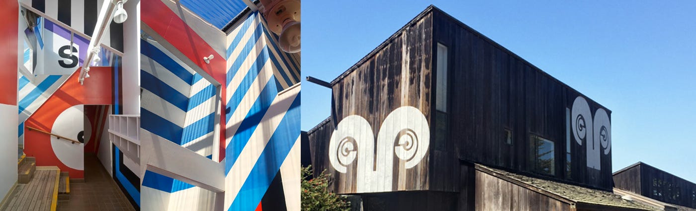
Sea Ranch, California, USA, 1968 Designer Barbara Stauffacher Solomon
Barbara Stauffacher Solomon is largely regarded as a pioneer in the Supergraphics movement, especially for her early work on the Sea Ranch development in 1968
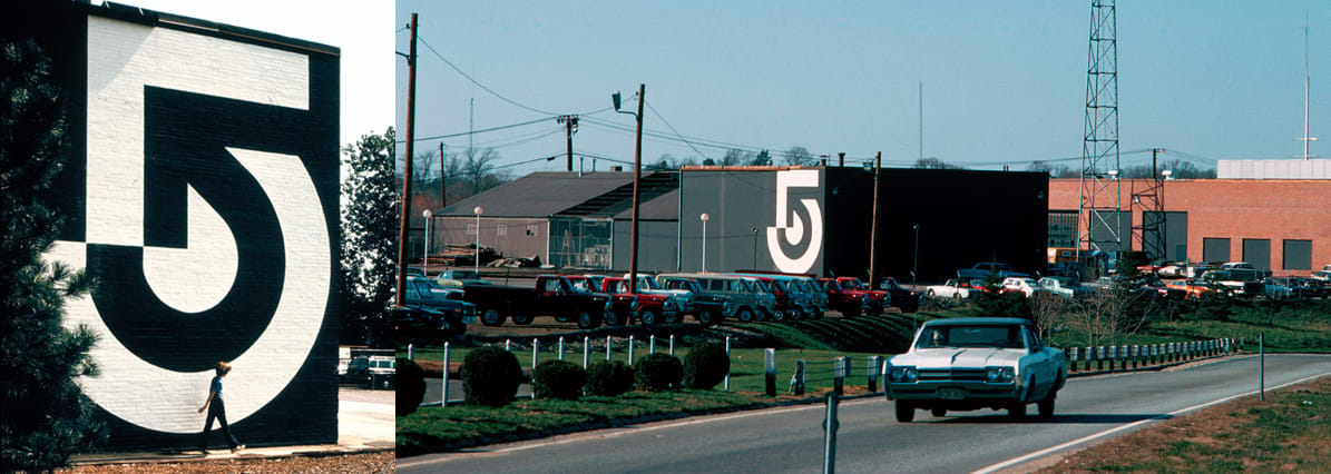
Channel 5, WCV-TV Boston branding, 1971 Designer: Lance Wyman
Lance Wyman is a legendary logo and brand designer, I’d recommend visiting his site
https://lancewyman.com/
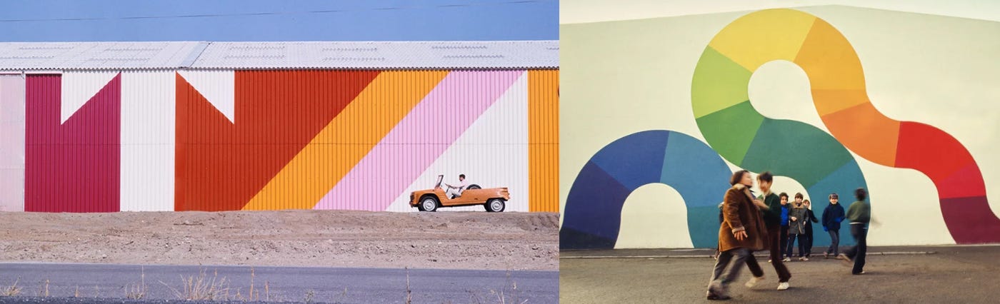
Left: Boatyard, Port Barcares Right: Aubervilliers, Paris suburbs, 1972
Jean Philippe Lenclos has some beautiful examples of supergraphics design from its peak in the late 1960s to 1970s especially, with use of colorful geometric designs and large-scale applied typography. Source: https://www.jeanphilippelenclos.com/fr/supergraphisme

The Kentish Town Health Centre ( 2009, architect: Allford Hall Monaghan Morris ) had a collaboration in its design with Morag Myerscough, a celebrated designer of supergraphics. Here you can see an example of the surface-crossing application. ( source: Architects Journal )
Challenging spatial perception, or spatial transformation, is an aspect of the style that sets it apart from simple graphic design and signage. Supergraphics are not necessarily bound by the architectural planes they sit on, flowing over multiple surfaces and transforming how a space is read or experienced.
From its peak in the 1970s Supergraphics started to decline in popularity. However it did have a resurgence in the 2010s, appearing in interiors and on the surfaces of some buildings. This time makes me think of the giant typography, floor numbers and interior wall graphics of the time, particularly reminding me of corporate or startup offices for some reason, but examples can be found in public buildings also.
Supergraphics in Videogames
Sci-fi Supergraphics
Supergraphics in videogames are quite frequently seen in scifi settings, with echoes of 1970s sci-fi art in the application of logos and patterning that spans across world entities and environments. The scale and surfacing of scifi seems to particularly suit this treatment.
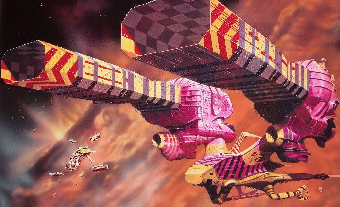
Chris Foss Guild Tug concept for Jodorowsky’s doomed Dune movie c.1975 (source: chrissfossart.com )
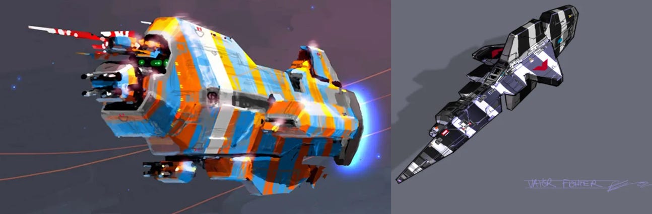
Homeworld ( 1999, Relic Entertainment ) concept art , artist: Rob Cunningham
Of course Homeworld is the most famous and direct reference to Chris Foss’ look that comes to mind, adopting similar large-scale faction branding and graphic banding and block colorization.
Scale and branding are usually a large part of the properties of supergraphics in this context, they span across surfaces and are not contained as functional graphics and signage may be. Here the branding of a location can range from purely aesthetic, to cultural or territorial ownership reinforcing narrative or supporting gameplay zoning. You can see examples of this in game worlds such as Destiny or Arc Raiders.
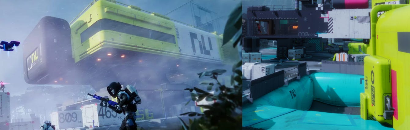
Marathon, Bungie, 2026
Marathon of course is a more recent example, and perhaps the heaviest use of graphics applied to the surfaces of a world’s architecture I’ve seen. Not only is there a large amount of brand and graphic design elements, but distinct parts of the architecture are heavily colorized, reminding me of the industrial architecture work of Jean-Philippe Lenclos ( below ).

Aciéries Solmer à Fos-sur-Mer, 1975-77, Designer: Jean-Philippe Lenclos. Source: https://www.jeanphilippelenclos.com/fr/atelier-3d-couleur
Interestingly you tend to see this form of graphic design in game worlds applied more than true functional signage used as diegetic navigation for players.
Usually players have a UI for that: mini-maps, hud elements and markers that sit on an information layer between the player and the world. It’s understandable though, as applying signage within a world can be a challenging undertaking, both logistically and consuming texture memory. UI is often seen as an easier ROI for navigation needs of players.
Functional Diegetic Navigation
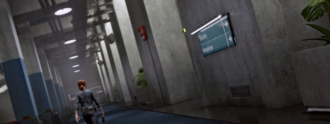
Control, Remedy Entertainment, 2019. Source: https://nerdwithglasses.com/2021/02/09/screenshots-control/
Sometimes you can see the application of true signage within a world: in Control signage was functional, but also had more value than purely navigation as it helped not only the immersion and wayfinding for the player in a semi-open metroidvania environment, but acted as another expression of the bureaucratic culture within it where everything has to have a label.
Layering and Cultural Imprint
I think possibly my favourite videogame example of the application of supergraphics can be seen in Deathloop. Arkane are masters at worldcrafting: Dishonored and Prey are wonderfully crafted worlds with a strong design ethos carrying through buildings and level architecture through to individual props. With Deathloop they tell a more layered story of repurposing and ownership of spaces within the world.
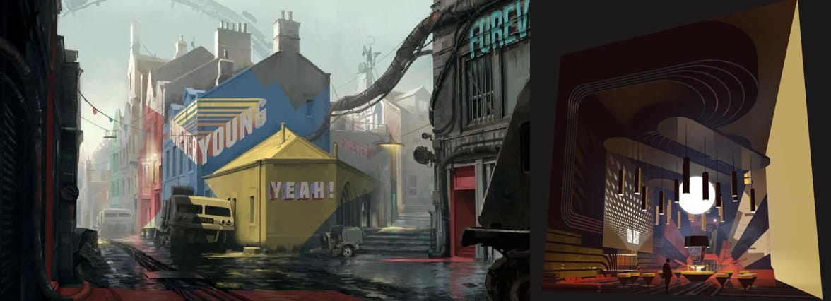
Deathloop concept art, 2021, Arkane Studios
The bright hedonistic vibe from its new culture’s occupation through strong geometric forms and bold use of typography in striking colors contrasts vividly with this older more muted architecture of the world before the game’s events. It expresses faction ownership and expression, while telling the story of change and layering of history. The graphics themselves echo the look of supergraphics of the 1960s and 1970s and contributes toward the unique look for the title and its world design.
Challenging perception
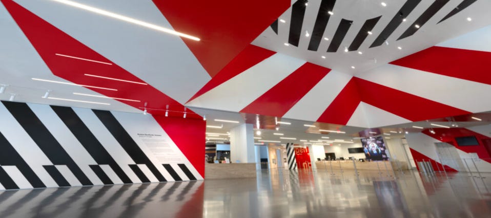
SFMoMA, Strips of Stripes ( installation view ), 2023. Designer: Barbara Stauffacher Solomon, Photo: Don Ross
Here is a good example of Supergraphics’ ability to alter and challenge the perception of space. The geometric patterns deconstruct and reform surfaces to the viewer’s eye.
This is an aspect of the real-world Supergraphics that I haven’t experienced much in videogames compared to the more cosmetic patterning and branding at scale. It leans heavily into their ability to flow over differing surfaces, making new spatial connections and rewarding specific viewer positions, movement through space or sightlines.
Interestingly, it is something that reminds me of experimental dazzle camouflage from navy ships during WW1, where large geometric color blocks were used to disassemble and distort the silhouette of a ship at sea. I haven’t found any direct reference to influence in supergraphic design, but the aesthetic similarities are there.
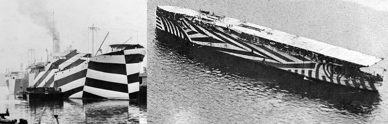
Left: USS West Mahomet c.1918, Right: HMS Argus c.1918 ( source: Wikipedia )
Much like the dazzle camouflage similarity, the ability for larger graphics to alter the perception of space and form is perhaps a problem for videogames, and something that could be very case specific. I think there are two main reasons for this:
One - So much work goes into conveying a sense of readability and realism in game worlds to support immersion that to challenge and contradict that work could be seen as largely counterproductive. Disorientating players can be deceptively easy, and often something you have to iterate on level design specifically to avoid.
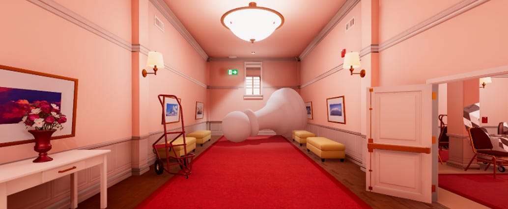
Superliminal, PillowCastle, 2019. Still images don’t do the game justice though, you really need to see it moving to communicate the spatial experience it gives.
Two - In videogames we just have much more potentially effective ways of challenging perception. We are creating a virtual space, so the very substance of the world is pliable and can be altered in more fundamental ways. A good example of this would be Superliminal, which challenges the viewer’s perception of space in a more fundamental way.
That said with considered application in the right world design I could see its use in altering spatial experience or visual impact being very effective. It’s something I would be interested in seeing as a visual experiment more, there is untapped potential here, and it could be used to add depth of design to a world’s architecture.
In summary, there is potential for supergraphics as part of the world designer’s toolkit. Given the right setting or world story there is potential gain for considering their use, namely:
Visual interest, more layered world architecture
Cultural imprint and world narrative expression.
Visual change between similar or identical structures or materials.
There are however technical and design challenges to be aware of in their use that constrains its wider use:
Logistics ( Inflexibility of space ). A need for level design change and iteration often leads to more modular solutions. Large supergraphics applied to a surface can essentially lock it in place and as such it becomes something more for the latter stages of world production.
Technical ( Texture memory ). Projecting additional layers onto the surface of a game world and at scale the texel density requirements for large graphics can be a concern.
While these limitations remain, they can be overcome: Marathon is perhaps a more extreme example of this, whether you love or hate its vivid colors and bold graphics. The usage of supergraphics still remains largely untapped for videogames and their ability to shape spatial experiences.
Architectural projection has introduced motion graphics mapped to architectural surfaces. Could something similar act as a bridge between the UI information layer and the architectural surface of the world, bringing motion and change with it? For example I remember 2010’s Tom Clancy’s Splinter Cell Conviction using projected typography in-world to inform the player, there is potential to do so much more now.
This is one of the coolest things I have read.