
Just passing through
Videogame Hub design vs Airport Terminal design

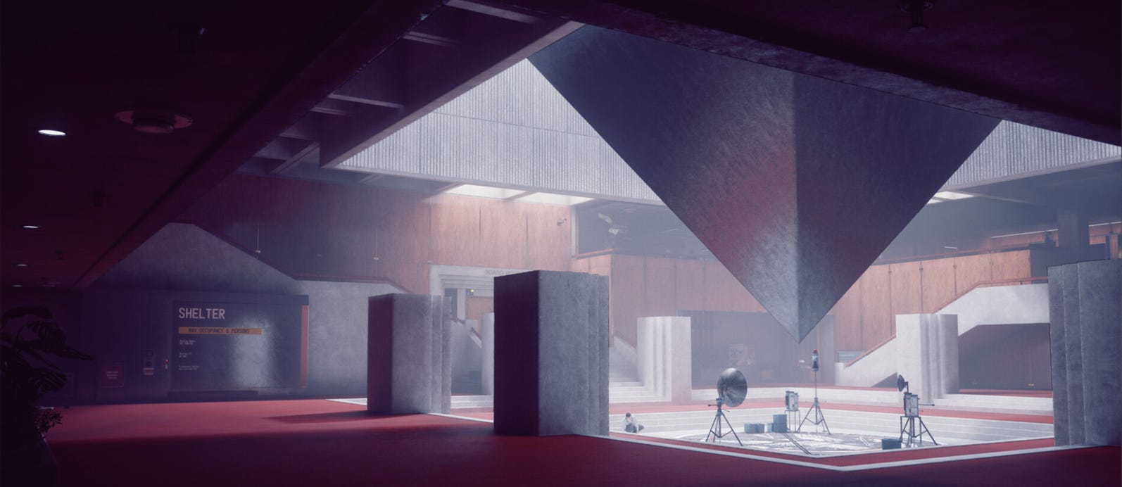
I travel a little with my work, and find myself sitting in airport terminals quite often. One thing that I found myself noticing was the parallels between in-game player hubs and the design of the terminals. I love designing hubs as they’re a true challenge of balancing experience with efficiency in use to create something that can be navigated intuitively and bear repeated visits throughout the game’s playtime.
Both game hubs and airport terminals are places designed to efficiently address a range of needs while people pass through their spaces. If you think of the flights and gates as quests or equivalents from a game space the comparison becomes clearer when you think of people moving between these. This led me to see what experience design thoughts and research for terminals may be useful to improve approaches to hub design layout and architecture.
I started digging a little deeper and reading further into research papers and findings on terminal design and experience design and discovered something.
A research paper from 2015 entitled ‘A new model for airport passenger segmentation’ ( Harrison, Anna, Popovic, Vesna, & Kraal, Ben J.) discussed a study carried out at Copenhagen Airport that categorized users into four groups.
What surprised me was the startling similarity of this ‘Copenhagen Taxonomy’ to Bartle’s Taxonomy of player types.
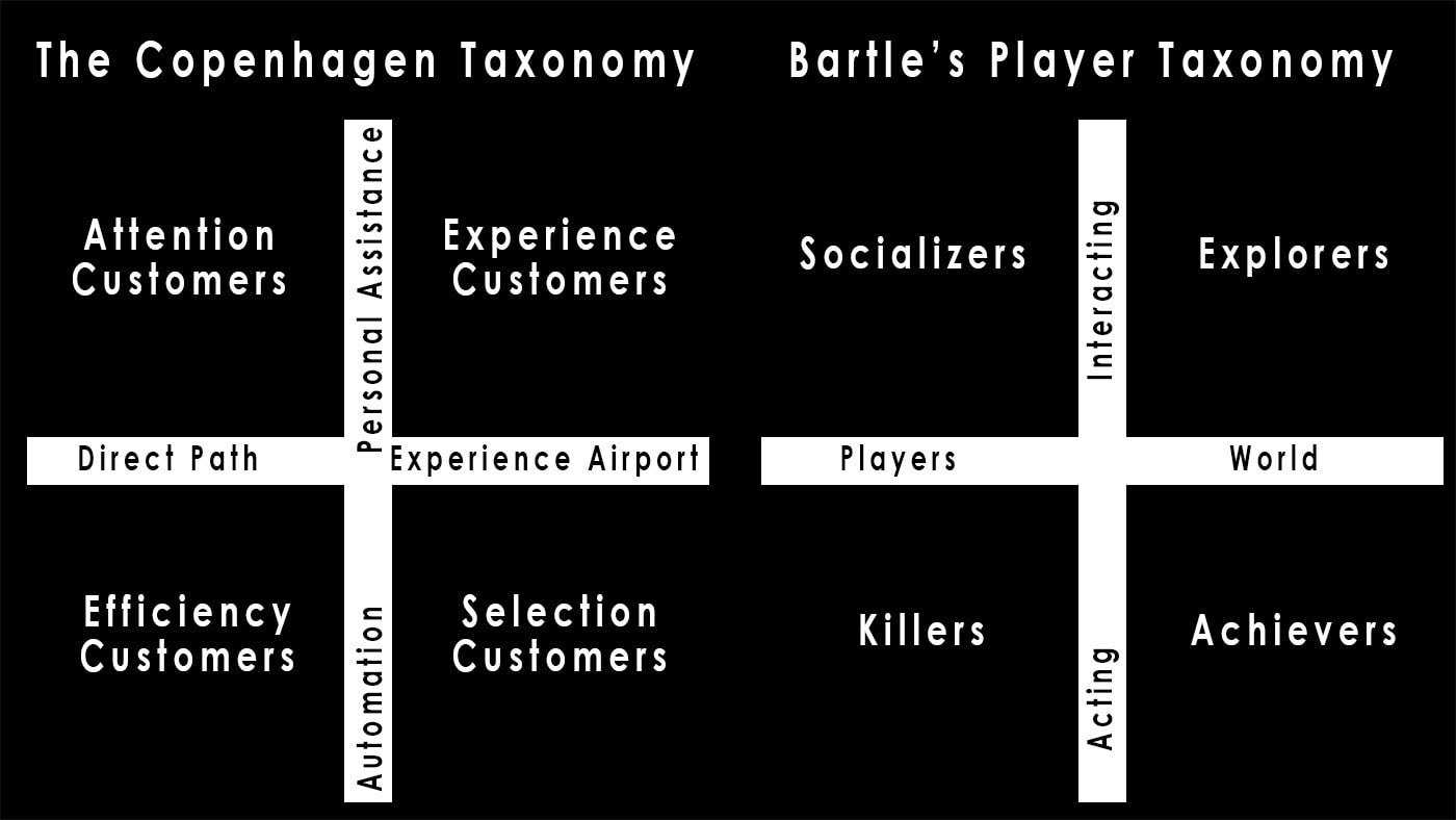
Bartle’s Taxonomy is perhaps one of the simpler and well known breakdowns of game player types and their preferences ( there are other models employed by larger publishers and game devs too ).
If you haven’t seen this player segmentation before, it’s worth watching the GDC2017 talk covering the design of Prague city hub in Deus Ex: Mankind Divided by Sylvain Douce as it’s a good example of how this form of player type profiling can be applied to hub design.
I knew I was perhaps onto something here with possible learnings for architecture and experience design for these places. Perhaps there can be some learnings or similar design principles and approaches to be found.
Judging by the sheer variety of designs of terminals there seems to be no perfect solution: however some of the more established architectural techniques of creating user profiles ( aka user stories ), spatial groupings, adjacency matrices and flow graphs can be ( and have been ) utilised in level design too.
Interestingly some of the research on terminal experience design discussed the use of Time, it’s perceived value and each group’s sensitivity to it. This was applied as a metric in guiding the categorization of passengers, which does have some parallels in games: players use time and convert it to the much more subjective ‘fun’, or possibly you could say progression ( for example crafting systems where you can clearly perceive that conversion of your time into in-game value). It’s subjective what is valuable to convert time into of course, but more often than not travel time will not be the most desirable.
For a hub this becomes especially relevant as some players often want to be as efficient as possible in a hub to return to the core game experience, time becomes a valuable measurement. For other players its relative value can vary and may seek to invest time in the hib space for social engagement ( if in a multiplayer game ) or deeper lore or knowledge of the game world.
Pure efficiency might satisfy one player type ( Bartle’s ‘Killer’ ), but in our interests of experience design, sometimes the scenic route and a little inefficiency is more important.
Mapping user stories
The similarities continue when you start to look at the activities and user stories with both spaces. This is a really helpful exercise in building a picture of how your space will be used and what features it will need to contain. For example:
the New Arrival
process the new arrival, introduce them to the world, orientate them
game - the first tutorial mission or entry narrative into the gameworld that guides the player to and visually introduces the hub
airport - the journey from kerbside to flightside ( arrival, check-in desks, handing over your baggage, security )
Socializing
a place to potentially socialize and waste time...
game - player lobby ( shooting/testing range, multiplayer social areas, npc interactions )
airport - passenger lounges, bars or cafes within the terminal space
Consuming
place to trade, craft, consume
game - shops, trading space, crafting locations
airport - shops, restaurants
moving from objective to objective
game - task completion/hand-in, selecting new task and leaving for next one
airport - moving between arrival gate to other terminal gate to depart, using departure board(s)
One technique in testing your hub design is to take these activities and create short user stories ( ‘I have completed a mission I need to hand in and find another’, ‘I need to upgrade my equipment and return to an ongoing mission’,’I want to review collected lore or further the main story’,’I want to hand in these items and upgrade my character’ ) based on what you can do within your game and what services or features your hub contains. Then trace the paths onto your plan of the hub ( once in initial layout or block modelling ), see if the design works as a space for repeated use.
This builds a theoretical ‘heat map’ of routes that you can test your plan with.
Much like a multiplayer map, it should offer a choice of routes, should be highly permeable space and allow efficiency, intuitive navigation, overviews, vistas and easy mental modelling of the space for navigation.
This can help highlight long routes, or backtracking that a player story may result in, Loops and flowing paths are always best, so reducing the amount of dead-end points is important.
What are the symptoms or signs to look out for when the design fails to satisfy these user stories?
Desire paths
Probably the lesser problem is when players find their own routes and efficiencies within the hub architecture. It’s effectively the player speed-running your hub. This might not be much of a problem for the game experience, but it is a sign that the intended design has a failure point that should have been picked up through the player story, flow and route planning process. That said you don’t want to fall foul of the “you’re not playing it right” arrogance of the designer that can happen, if players are engaged and immersed in the design regardless, it’s a win. Maybe its an affordance that could be embraced rather than bandaided.
Fallback to UI
A sign your hub is not working is if the player quickly falls back to navigating the UI and menu system ( if the game allows it ) rather than being physically present and using the hub. Of course it may be impossible to avoid most players setting on this eventually. Warframe is a good example where the player hub can quickly get superseded in usage by the more efficient UI menu flow to get the player back into the mission loop. However the longer they feel engaged with the hub the more immersive and compelling your world will be.
This is a tricky subject. It could be better to aim to be as frictionless in your hub design as possible and avoid offering a pure-UI approach to the hub loop, aiming to preserve immersion in your world at the cost of a little more efficiency. The scope of playtime of a game may affect this decision though: when your game is hundreds or even thousands of hours of playtime even a little friction can get too much.
Spatial blocking similarities
There are some layout type similarities between both airport terminal design and game hubs too. It’s interesting to see how the design efficiency translates between the two.
There are a few main archetypes that terminal design employs: hub-and-spoke, linear, circular , finger and separate satellite island forms.
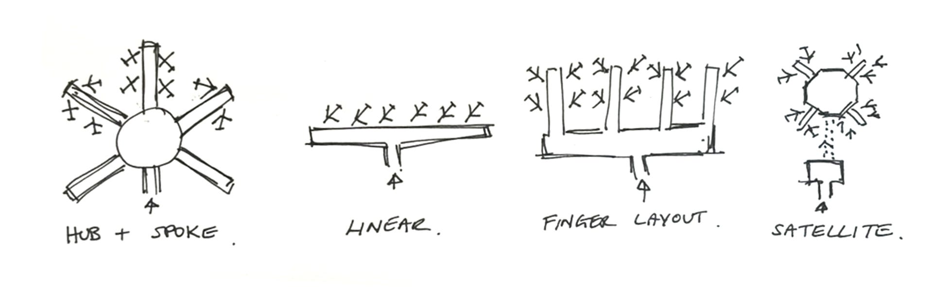
Hub and spoke has a central terminal with gates arranged radially around. It’s more efficient for increasing the number of airplanes that can park at gates, but more importantly it makes it efficient for passengers to reach the airplanes. It also creates a circular centralized area that can support more free looping flows.
Linear is more of an older original layout, where the numbers of gates are limited. It’s a narrow terminal design, so to move from kerbside ( main entrance ) to flightside is relatively short, however as you increase the needs for more gates you end up with a long linear form, making travel time for passengers longer.
The finger layout is an evolution of this, with the gates stretching out away from the main terminal building to increase the amount of airplanes that have access. It can lead to a terminal breaking into discernable chunks, each with duplicated facilities or space to fow. It fragments the main body of passengers.
A satellite design is the most efficient for the airplane ( which we care less for when thinking as gates as mission points for a game analogue ). Much less efficient for passengers as they have to travel to the gate buildings that are separated. It also leads to duplication of facilities and a break in the visual continuity from kerbside to flightside, so compromises intuitive navigation also. I wouldn’t tend to see a lot of comparison or learning in this design as I mention it makes for a poor analogue in games as the focus is on flightside airplane efficiency rather than quality of passenger experience ( our players in a game hub )
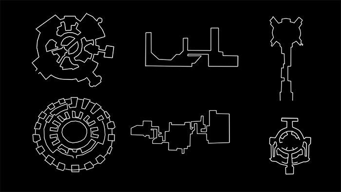
Above you can see ( left to right ):
1- World of Warcraft’s Ironforge and Paris Charles de Gaulle with hub-and spoke layout, moving around the promenade of functionality at its periphery.
2 - Destiny 2’s Tower and La Guardia ( finger design ) with three connected island blocks, which can increase travel time between distinct districts or locations.
3 - Darksouls 3’s Firelink Shrine and LAX Terminal 3 with a central spine and circular hub.
Of course there are a multitude of differing design solutions for both game hubs and airport terminals, but it is easy to find examples where even superficially the layout solutions have been remarkably similar.
For the most part, as player efficiency and a tighter experience is paramount, game hubs will likely copy the hub and spoke or more centralized layouts where functions can be easy to navigate between and support different permutations of user stories.
Design Tools
When it comes to design principles of the actual space, a few emerge from passenger-centric experience design and architecture that many game level designers would find familiar from their own toolkit of ways to influence and encourage player behaviour.
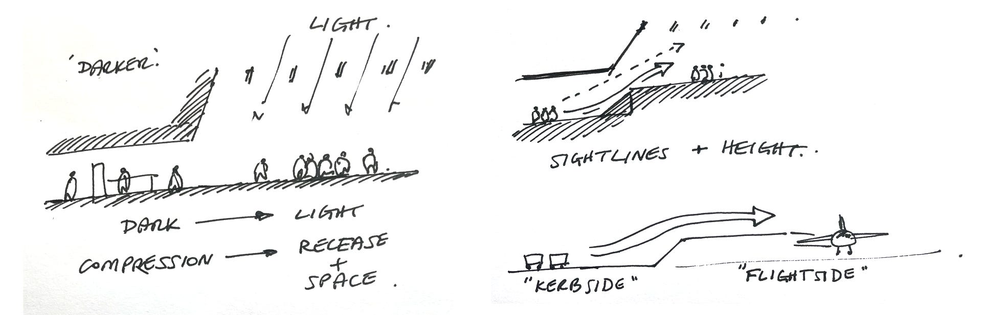
Visual connection
Clear visual connection between areas so player can build a clear mental picture of the space for navigation. Seeing through from arrival and check-in to security and through to the terminal and eventually sightlines to the aircraft and gates
Use of light
People are drawn to light and pushed out of darker areas. This is used to propel users through security areas and areas where flow is critical to brighter gate hubs and retail areas.
Surface patterning
Especially in floor surface patterning, but also on walls and ceilings. Adding directionality and expressing flow is a way to encourage movement in users and provide hints on direction and navigation.
Use of verticality
The movement from kerb-side to flight-side can involve some vertical movement ( planes are entered above ground level by skybridges ). This ascension can be leveraged with the use of dark to light to encourage movement and express direction.
In addition, the use of compression and release of space can be seen as a use of verticality and volume. People don’t want to stay in tighter spaces and as in games the rhythm of compression and release of space can be used to encourage movement.
All these techniques support one key aim: a focus on intuitive navigation over reliance in signage. A lot of information needs to be communicated to users and the more intuitive support a space can provide to navigation and movement the less overburdened graphic design and signage becomes, or in the case of videogames, the use of minimaps, POI markers and golden path markers.
Summary
Overall it’s an interesting observation on the similarities with this comparison, but what can we learn?
I believe the learnings flow both ways. Both games and architectural experience design such as this require careful design to cater for the different user profiles and deliver an optimal experience.
It would be easy to say techniques for efficiency of navigation and movement are our main takeaways, but white both require this, its importance to differing user groups makes this only part of the puzzle. While you have the ‘power user’ of business travellers or ‘killer’ profile gamers, you also have your tourists and explorers. Those user groups require a more stimulating environment to deliver a richer travel experience or in the case of games deepen immersion through immersion in the world and its lore.
Games succeed more in this aspect of experience design offering memorable and engaging moments within a space, not necessarily in a post-modern, theme park fashion, but in the way they can be more playful with space and spectacle than real-world architecture can.
Personally I think the act of seeing and analysing these real-world parallels leads to deeper thinking and improvement on building a critical eye for spatial design and expanding that toolkit of approaches and knowledge needed for world design.
References
Bartle’s Taxonomy of player types:
https://en.wikipedia.org/wiki/Bartle_taxonomy_of_player_types
Harrison A, Popovic V, Kraal B (2015)
A new model for airport passenger segmentation
Journal of Vacation Marketing, June 2015
Available at: https://www.researchgate.net/publication/276349137_A_new_model_for_airport_passenger_segmentation
Copenhagen Taxonomy source referenced in above paper:
Tarbuck S (2012) Copenhagen Airport: Meeting our passengers’ expectations for the future, today! Passenger Terminal Conference, Vienna, Austria.
Unlocking the Passenger Experience through Integrated Airport Design - Grimshaw
The Secret to Good Airport Design: Aesthetic vs Efficiency | Architectural Digest
https://www.gensler.com/blog/why-airports-must-create-place-of-sense-to-engage-travelers
The Psychology of Airport Design
https://community.infiniteflight.com/t/the-psychology-of-airport-design/994051
Sylvain Douce
GDC2017 - A city of thousand choices:Prague city hub in Deus Ex Mankind Divided
https://www.gdcvault.com/play/1024502/A-City-of-a-Thousand
Adjacency matrix example: